Bite into the Brand.
After the outbreak of the Coronavirus pandemic, people are turning to delivery and takeaway services for food and goods. With many chains becoming even more popular due to their convenience and quick delivery to each persons’ door with minimal effort.
The major chains have more in common than delivery speed and cheap prices though; with common typefaces and colour schemes, the brands are easily recognisable within the market and across cuisines.
Fast Food

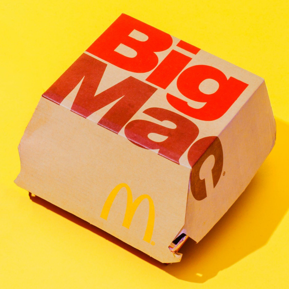
McDonald’s lettering for example is rigid, each character made up of a series of blocks. Further all the letters are in uppercase which aids the readability of each word, this is key in the food industry due to the demographic profile. For instance, the products are aimed at all age groups and therefore needs to be simple words that even young children can understand with ease. Additionally, many people have allergies so typeface needs to ensure that any person can identify potential allergens easily.

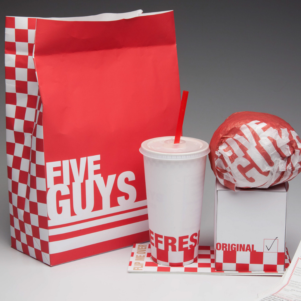
This is continued throughout the market sector as seen in the Five Guys package design, a chain that also sells burgers and fast food. Where both businesses also opt for a red colour palette, this makes the food seem more appealing and increases the likelihood a person will choose the brand and make a purchase. This is potentially because, red connotes a sense of allure and is naturally striking but also supports that red is the most attractive colour.
Sandwich and Pizza Chains

Other sectors also display these characteristics for instance in the Subway logo we see clear lettering. However, in this case the colours have changed. Subway use yellow and green which may signify nature and therefore the use of natural, fresh ingredients which aligns with the brand promise for many sandwich companies.

Similarly, as touched on in our previous article colours such as blue trigger a calming response in consumers and provide a sense of escapism. Brands like that of Domino’s use this colour to tap into this, hoping that in seeing it a person is more likely to buy their product for their Friday night in lockdown simply because it feels restful and easy. And comfort is the biggest sell.
